Introduction to Seaborn - Python
rpi.analyticsdojo.com
Overview
- Look at distributions
- Seaborn is an alternate data visualization package.
- This has been adopted from the Seaborn Documentation.Read more at https://stanford.edu/~mwaskom/software/seaborn/api.html
#This uses the same mechanisms.
%matplotlib inline
import numpy as np
import pandas as pd
from scipy import stats, integrate
import matplotlib.pyplot as plt
import seaborn as sns
sns.set(color_codes=True)
Distribution Plots
- Histogram with KDE
- Histogram with Rugplot
import seaborn as sns, numpy as np
sns.set(); np.random.seed(0)
x = np.random.randn(100)
x
Distribution Plot (distplot)
- Any compbination of hist, rug, kde
- Note it also has in it a KDE plot included
- Can manually set the number of bins
- See documentation here
#Histogram
# https://seaborn.pydata.org/generated/seaborn.distplot.html#seaborn.distplot
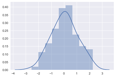
ax = sns.distplot(x)
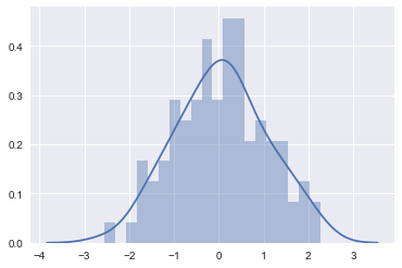
#Adjust number of bins for more fine grained view
ax = sns.distplot(x, bins = 20)
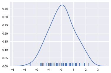
#Include rug and kde (no histogram)
sns.distplot(x, hist=False, rug=True);
#Kernel Density
#https://seaborn.pydata.org/generated/seaborn.rugplot.html#seaborn.rugplot
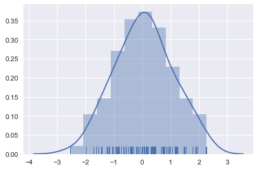
ax = sns.distplot(x, bins=10, kde=True, rug=True)
Box Plots
- Break data into quartiles.
- Can show distribution/ranges of different categories.
Jhguch at en.wikipedia [CC BY-SA 2.5 (https://creativecommons.org/licenses/by-sa/2.5)], from Wikimedia Commons
sns.set_style("whitegrid")
#This is data on tips (a real dataset) and our familiar iris dataset
tips = sns.load_dataset("tips")
iris = sns.load_dataset("iris")
titanic = sns.load_dataset("titanic")
#Tips is a pandas dataframe
tips.head()
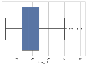
ax = sns.boxplot(x=tips["total_bill"])
# Notice we can see the few ouliers on right side
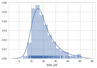
ax = sns.distplot(tips["total_bill"],  kde=True, rug=True)
Relationship Plots
- Pairplots to show all
- Regplot for 2 continuous variables
- Scatterplot for two continuous variables
- Swarmplot or BoxPlot for continuous and categorical
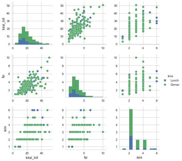
#Notice how this works for continuous, not great for categorical
h = sns.pairplot(tips, hue="time")
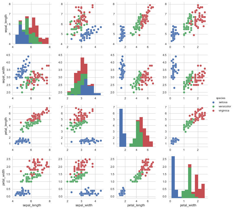
g = sns.pairplot(iris, hue="species")
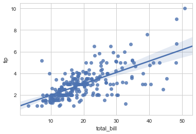
# Show relationship between 2 continuous variables with regression line.
sns.regplot(x="total_bill", y="tip", data=tips);
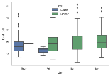
# Break down
sns.boxplot(x="day", y="total_bill", hue="time", data=tips);
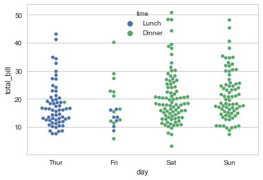
#Uses an algorithm to prevent overlap
sns.swarmplot(x="day", y="total_bill", hue= "time",data=tips);
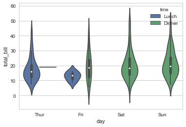
#Uses an algorithm to prevent overlap
sns.violinplot(x="day", y="total_bill", hue= "time",data=tips);
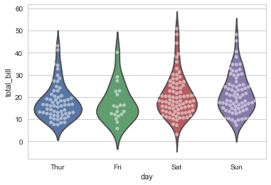
#Stacking Graphs Is Easy
sns.violinplot(x="day", y="total_bill", data=tips, inner=None)
sns.swarmplot(x="day", y="total_bill", data=tips, color="w", alpha=.5);
Visualizing Summary Data
- Barplots will show the
#This
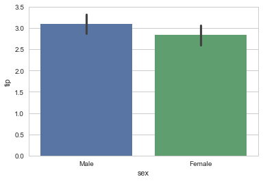
sns.barplot(x="sex", y="tip", data=tips);
tips
tips
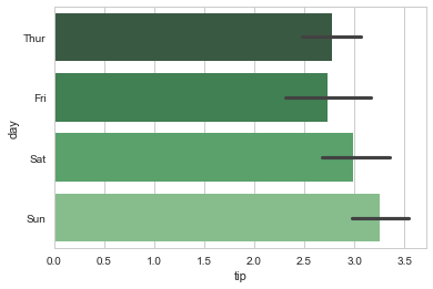
#Notice the selection of palette and how we can swap the axis.
sns.barplot(x="tip", y="day", data=tips,  palette="Greens_d");
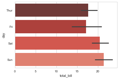
#Notice the selection of palette and how we can swap the axis.
sns.barplot(x="total_bill", y="day", data=tips,  palette="Reds_d");
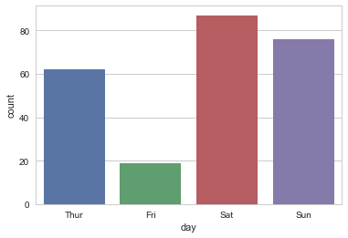
#Saturday is the bigger night
sns.countplot(x="day", data=tips);

